About
Life is a series of adventures that leads us down unexpected roads. My name is John and I'd love to be a part of your adventure!
I live in sunny Lodi California, the "Zinfandel Capital of the World!" Think Napa but significantly less crowd, half the cost, and great wines! It's here in Lodi that I made a career out of being a mathematics and AP Computer Science teacher, helping students grow and prepare them for their upcoming journey outside the school walls.
I love being a teacher because it enables me to do something that help change people's lives. I'll never really stop being a teacher, but after sixteen years of helping students prepare for their adventure, I'm ready to start my own adventure in data
Years of teaching taught me a lot about communicating complex concepts to other people, especially the difference between communicating and demonstrating. Communication is an interaction between two or more people, but a lot of times it becomes a performance instead of a conversation. My goal is to take my knowledge and experience in gathering, analyzing, transforming, and communicating data into a new field where I can help organizations make more informed, thoughtful decisions. I’m especially drawn to work that creates positive change, whether in healthcare, education, or any sector that values people and impact.
Why Hire Me?
Former Teacher, Adaptable Communication Specialist
- 16 years of experience turning complex concepts into engaging, digestible content.
- Experienced in collecting, analyzing, cleaning, and acting on all forms of data (structured, unstructured, quantitative, and qualitative).
- Problem solver. Skilled at using logic, mathematics, algorithms, and critical thinking in identifying, processing, and act on data and projects.
- Leadership: calm, cool, and collected. Easily adapts to requirements and changing needs. Thrives in dynamic situations and delivers.
- Wired to support, encourage, and nurture growth. Strong belief that team success comes before individual accolades.
- Organized and efficient. Values modular, repeatable, and defensible processes that make current and future work iteratively better.
- Unafraid of the unknown, ready to explore: always willing to learn new things and not afraid to see things through even when the path is unfamiliar.
Skills
Python (Pandas, NumPy), SQL, Google Sheets, Excel
Tableau, Matplotlib, Seaborn, Streamlit
Dashboards, slide decks, walkthrough videos
Logistic Regression, Random Forest, XGBoost, KNN
Tuned with BayesSearchCV; evaluated via F2 score, SHAP, PR curves
Git/GitHub, VS Code, DBeaver, Google Workspace
Git & Github
Education
- B.S. in Computer Science (AI & Robotics) – Colorado State University Global Campus (Oct 2024)
- M.Ed. in Education Administration – California State University Stanislaus
- B.A. in Mathematics – California State University Sacramento
Projects
This section contains a brief overview of each project. Links are provided for a deep dive into other aspects and components of each work.
Golden Valley Software Company - California Meal Periods Compliance Pipeline
This project is a demonstration of the creation of a Python-based pipeline that automates the cleaning, processing, evaluation, and summary report compilation of a fictional company's timecard dataset. The scenario is Golden Valley Software Company wants to build a pipeline that assesses their compliance with the California Labor Code 512(a) or the Meal Periods law.
Why this matters?
The Meal Periods Law establishes that California employers may not employ someone to work for more than five hours without a minimum 30-minute unpaid, duty-free meal period before the end of the fifth hour of the shift (4h:59m:59s). A waiver may be signed to indicate a mutual agreement between an employee and the employer to waive the first meal period if the shift is no more than six hours.A second meal waiver may be signed as an agreement between the employee and employer that allows for the employee to waive their second meal if the first meal was taken by the employee and the shift is greater than 10 hours but not longer than 12 hours.
Companies that fail to adhere to the Meal Periods Law may be subject to penalty and wage claim litigation. Under the Labor Code 512(a), employees may be entitled to a meal break premium of one hour of regular pay for each day that a violation occurs.
The Pipeline
The pipeline consists of the following parts:
- Main: the main module automates the entire cleaning, processing, evaluation, and report generation and integration of a user indicated raw timecard dataset.
- Explore and Initial Cleaning: Data integrity check, null value identification, datetime conversion, identifying valid data, and lunch_start imputation.
- Detect Break Violation: Compute and analyze shift length for lunch requirement, waiver status, and violation reason (missed lunch, late lunch no waiver, and late lunch with waiver).
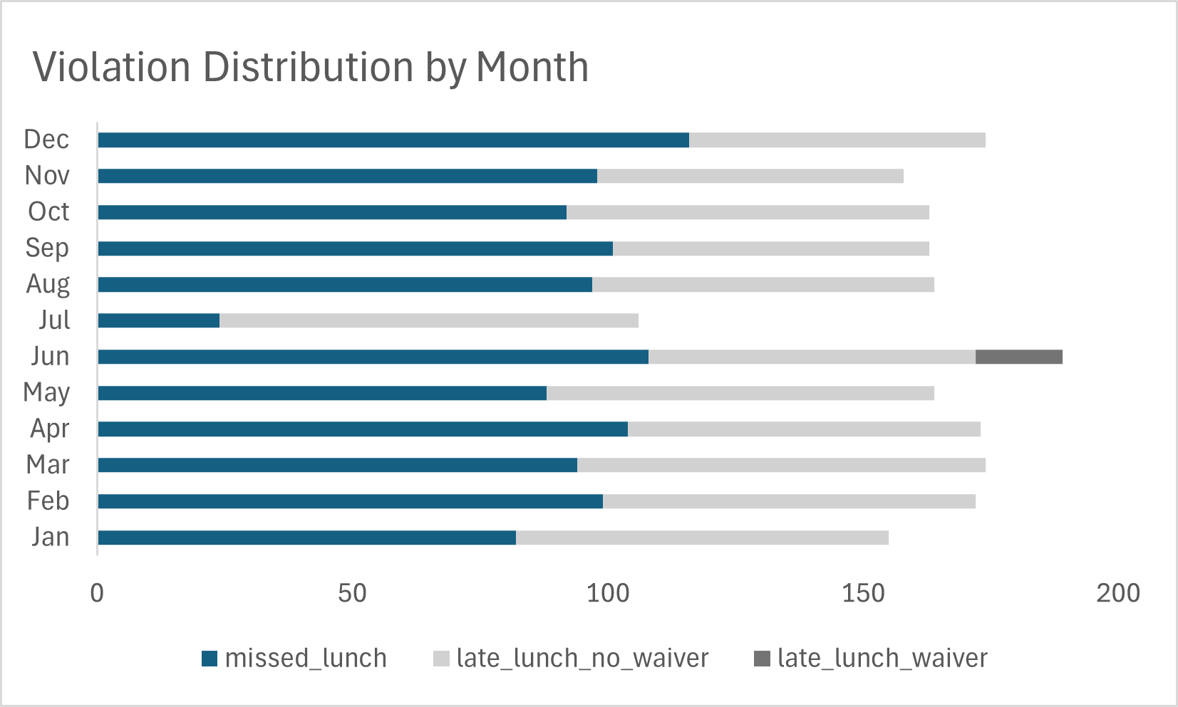
- Violation Summary: Create a monthly summary report for the newly processed dataset as shown in figure 1 below.
- Compile Year-to-Date Dataset: compile the individual monthly summary reports into one YTD dataset for report and dashboard integration.

Figure 1: Table summary of a monthly report generated by the pipeline
Here's a brief pipeline walkthrough video of how the automated system works.
Golden Valley's Compliance Overview
Based on our analysis of the timecard data between January 2024 through December 2024 we found:
- 4,830 valid shifts occured during that time period.
- 1,955 violations were found (40% of shifts).
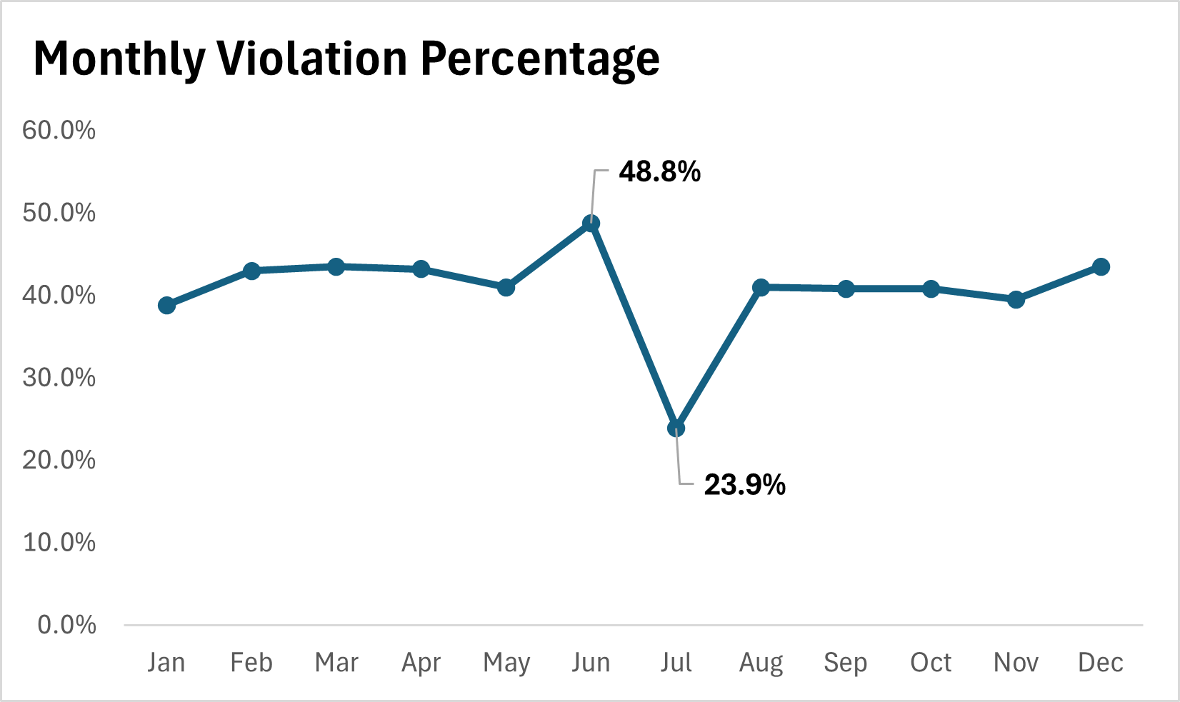
- The monthly violation rate ranges from 23 % to 48%.
- Missed lunch represented 56% of all violations and almost all are shifts greater than 5 hours.
- 43% of all violations were from late lunch with no waiver

These results indicate that a substantial portion of employee shifts do not comply with California Labor Code § 512(a), and may warrant further review by HR or legal counsel to assess potential exposure.
99% of the violations are a combination of missed lunches and late lunches without a waiver. The following actions may be considered to address this situation:
- Employee meal period retraining: Ensure that employees are aware or reminded of their right to a meal break before the 5th hour of work. Emphasize that if they have not signed a waiver and are working a shift that is longer than 5-hours but no more than a 6 hour shift, they are still required to take a timely meal break.
- Waiver informational meeting: Clarify the purpose and implications of a meal period waiver, specifically for shifts of 6 hours or less. Emphasize that waivers must be voluntary and mutually agreed upon in writing.
- Employee lunch scheduling: Carefully schedule and document meal periods so they begin before the end of the fifth hour of work (i.e., by 4h:59m:59s), unless a valid waiver is signed and the shift is no more than 6 hours. In that case, if a meal period is taken, it must begin with at least 30 minutes remaining in the shift to be compliant.
Check out the interactive Tableau Dashboard
Conclusion
Creating an automated ETL pipeline that cleans, evaluates, processes, summarizes, and loads a dataset is a valuable tool for any company that wants to have interpretable and actionable data in an efficient manner. Designing a custom pipeline for various applications and clients would be faster and easier once a baseline is established. Modularization is key a well documented and modularized pipeline makes the process easy to understand, recreate, debug/fix, and expand.
As always, any pipeline and analysis is only as good as its data. Careful and thorough exploration, cleaning, and processing of data is a constant and necessary part of any successful work in the data realm. This project involved iterative analysis of data, before, during, and after the pipeline work.
Reducing Stroke Risk Before the Age of 65
Did you know that nearly 90% of stroke patients under the age of 65 are married people? Of course, that doesn't mean marriage by itself, causes stroke. This is just a simple reminder that correlation is not always causation.
Why should we talk about stroke? Because stroke is one of the top 5 leading causes of death in the U.S., and its risk rises steeply with age.
Why Under 65?

Age is one of the strongest predictors of stroke, but while we cannot stop time, we can definitely prepare for the journey into our golden years. But what happens before the age of 65? That’s the focus of this project.
Project Goals
Our goals are:
- Identify the top risk factors among patients under 65
- Examine how these risks develop with age
- Suggest screening recommendations that can help clinicians and public health leaders help patients under 65 reduce their risk of stroke.
By focusing on patients under 65, we can temper down the dominance of age and gain clearer insight into the manageable and preventable risk factors of stroke.
Data Summary
The dataset used in this analysis included de-identified patient records with the following features
- Age and gender
- Hypertension, heart disease, BMI, and glucose level
- Smoking history, marriage history, work type, and residence type
Key Insights
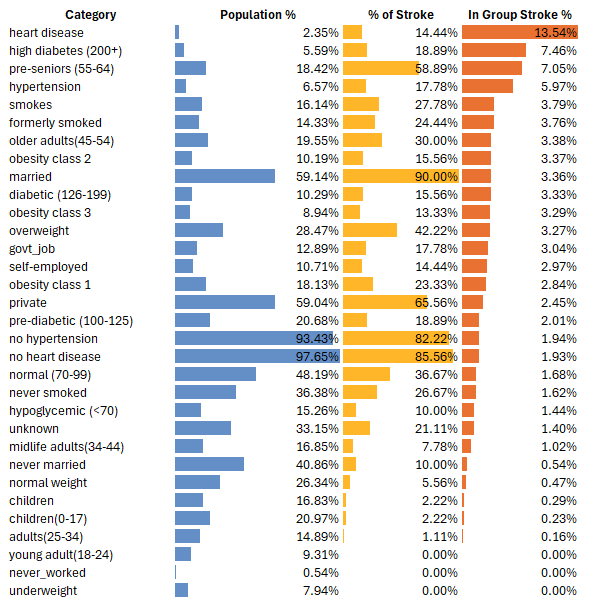
The Top 4 Medically Modifiable Risk Factors are:
- Heart Disease
- Hypertension
- Diabetes (4.78% | high diabetes at 7.46%)
- Smoking
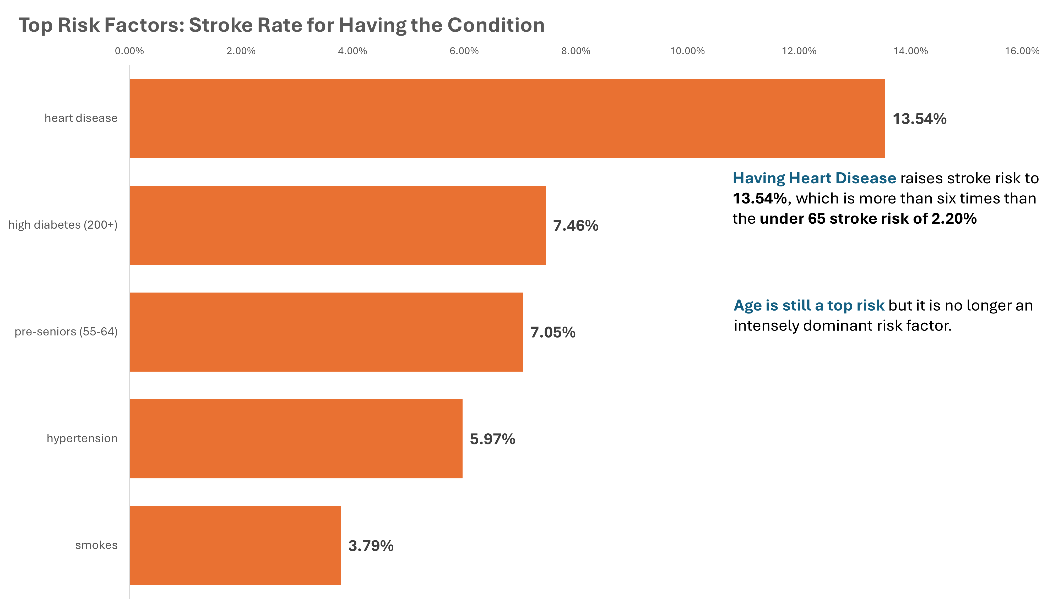
Notice that pre-senior (55-64) is ranked 3 on the bar graph. This shows that while age is still a strong factor it is no longer overwhelmingly dominant.
Heart Disease - patients with heart disease had a stroke rate of 13.54%, which is the highest among all risk factors. While they only make up 2.35% of the entire population, they account for 14.44% of all stroke cases. The number of patients with heart disease increases sixfold between the age of 35 and 44.
Hypertension - patients with hypertension had a stroke rate of 5.97% and this silent and symptomless disease can appear at any age. Its prevalence increases sahrply in young adults, where there is an elevel-fold increase in hypertensive cases between the age of 18 and 24.
Diabetes - diabetes is one of the most chronic medical conditions in the U.S. Patients with diabetes carries a stroke risk of 4.78% and it affects 1 in 5 patients between the age of 45 to 54 and rises to 1 in 4 between the age of 55 to 64.
Smoking - patients that smoke carries a stroke risk of 3.79%, while patients that quit smoking are not that far behind at 3.76%. Prevention is the key, because 1 in 4 patients would have a history of smoking between the age of 18 to 24.
Recommendations
- Hypertension and smoking risk assessment, education, and prevention plan as early as age 18.
- Diabetes screening and preventive care plan starting at age 25.
- Heart disease screening and preventice care plan by age 35.
Call to Action
Stroke risk factors begin developing well before the age of 65. By identifying and adressing heart disease, hypertension, diabetes, and smoking warly, we can help patients take action before these risks escalate into preventable medical emergencies.
AI Stroke Risk Tool
Every 40 seconds, someone in the U.S. has a stroke. Most are preventable, but what if we could simulate how machine learning might be able to assist in early stroke screening?
Context
This project uses the entire dataset, which includes patients 65 and over. Based on further analysis of patients under 65, an A/B test will be conducted using a soon-to-be-developed "Under 65 Stroke Risk Tool" to determine if stroke predictions for patients below 65 can be improved.
Disclaimer
This project is for educational purposes only and is not a diagnostic tool. The predictions are based on a limited, theoretical dataset and should not be used to make medical decisions or replace professional healthcare advice.
Problem
Doctors rely on experience and patient history to assess stroke risk. But early signs can be subtle, and some at-risk groups may be underdiagnosed. This project asks: "Can we use AI to simulate how early detection might work if trained on the right data?"
Solution
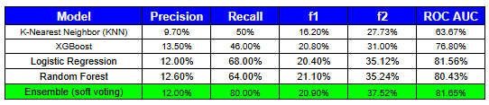
I built an interactive AI tool using an ensemble of machine learning models to estimate stroke-like risk from basic health inputs like age, glucose level, and medical history. Four models were built, tuned, evaluated, and considered:
- Logistic Regression (LR)
- K-Nearest Neighbor (KNN)
- Random Forest (RF)
- XGBoost
Among the models, Logistic Regression and Random Forest were selected to form the soft voting ensemble based on performance metrics.
Model Interpretability, Transparency, and Evaluation
Models were evaluated against the following metrics:
- Precision – The percentage of predicted positives that were actually true positives.
- Recall – The percentage of actual positive cases that were correctly identified by the model.
- F1 Score – The harmonic mean of precision and recall. Evaluates the balance between precision and recall, used when false positives and false negatives are equally important.
- F2 Score – Similar to F1, but gives more weight to recall than precision. This is important when identifying true positives is more critical than avoiding false positives.
- ROC AUC – Measures the model's ability to distinguish between classes across all thresholds. Reflects how well the model separates positive from negative cases.
Model transparency and interpretability were evaluated using the following tools:
- SHAP (SHapley Additive Explanations) – Explains individual predictions by quantifying the contribution of each feature to the final output. (Sample image shown below.)
- Confusion Matrix – A visual summary of model performance showing the counts of true positives, true negatives, false positives, and false negatives.
- Precision-Recall Curve – A graph showing how precision and recall change as the classification threshold is adjusted.
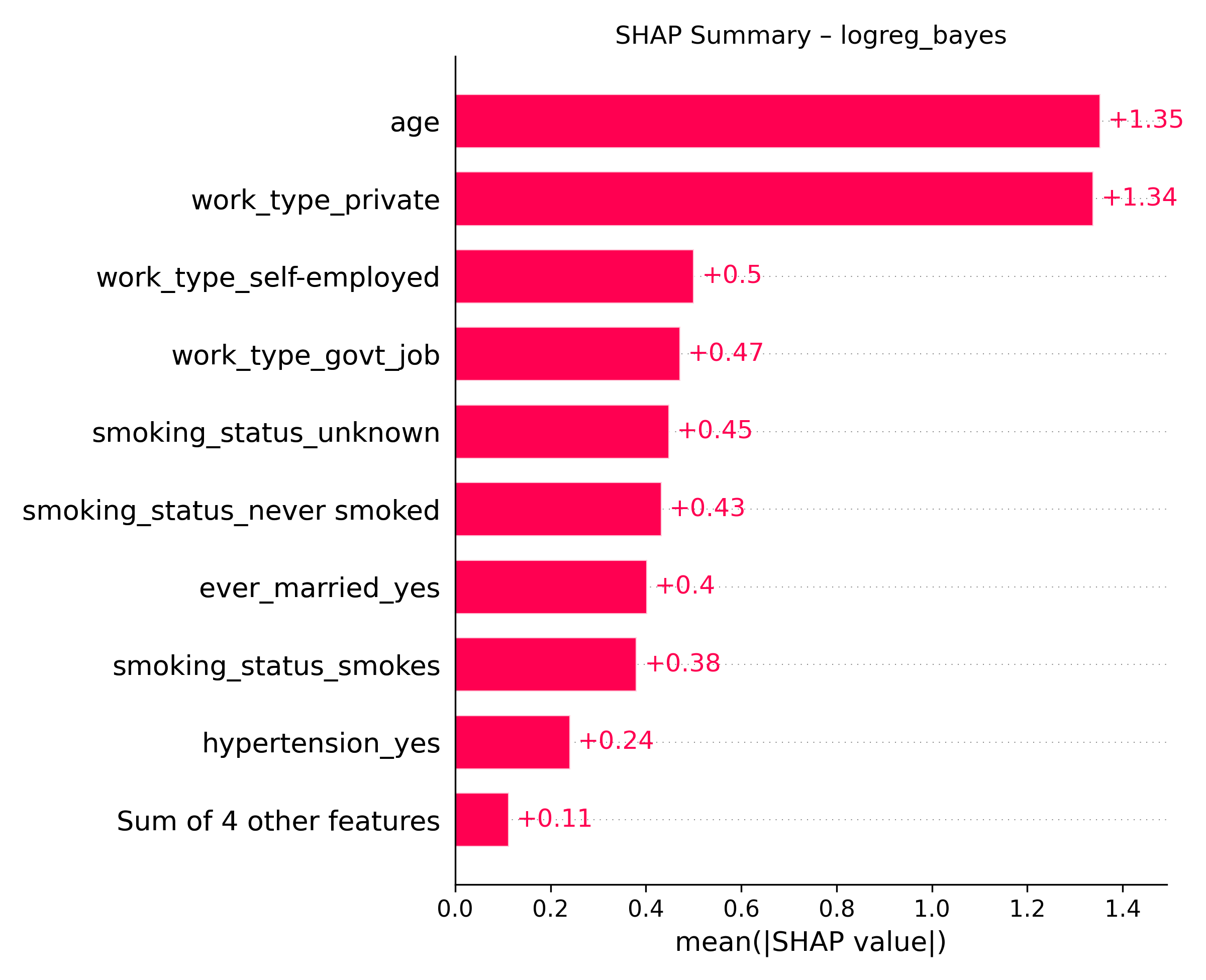
The SHAP summary plot above illustrates how the Logistic Regression model interprets each feature’s contribution to stroke risk, based on patterns learned from the training dataset.
Ensemble Model Performance
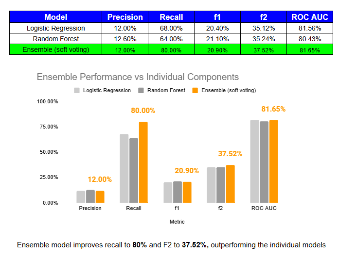
Soft-voting ensembles can lead to performance improvements by combining the strengths of individual models. In our case, the ensemble boosted both recall and F2 score while maintaining similar precision and ROC AUC. The chart and table above show that this approach helped catch more stroke cases without sacrificing accuracy.
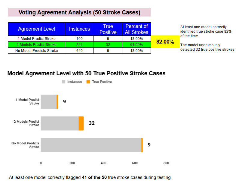
The image above analyzes how often our ensemble models agreed on stroke predictions. It shows that at least one of the models correctly identified a stroke case 82% of the time, and that both models agreed on 64% of all true stroke cases, highlighting the value of model agreement in boosting diagnostic confidence.
Interactive Tool Preview
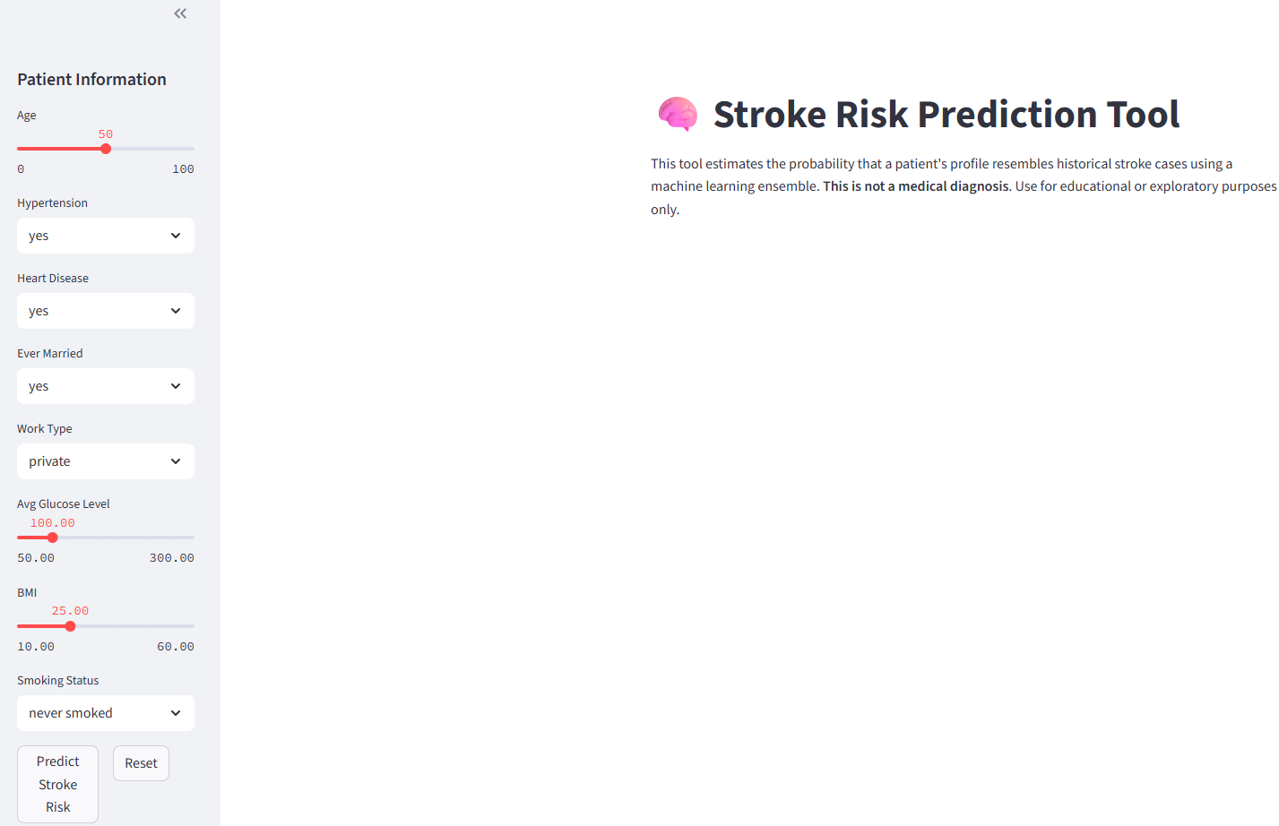

This AI tool is designed to receive user input and calculate a "stroke-like profile" score based on how similar the input features are to historical stroke cases in the dataset. It was built to explore how machine learning might assist in early screening and detection of stroke risk; not to serve as a diagnostic tool. Presenting a definitive “yes” or “no” could cause undue stress or misinterpretation, so the tool instead estimates how closely a profile matches patterns found in previous stroke cases.
The stroke-like profile score shown in the app reflects how strongly a person’s health profile activates the patterns the models have learned to associate with stroke risk. It is based on probability outputs from two models, Logistic Regression and Random Forest, and is averaged to provide a single interpretable score. This score is not a diagnosis, but a signal of how closely the input resembles patterns commonly linked to stroke in historical data.
As an added feature, the tool also includes a forecast that simulates how stroke risk may evolve over time. It displays how the risk profile changes in ten-year increments, helping users understand how age interacts with other health factors. This not only enhances the tool's educational value, but also demonstrates how predictive modeling can support long-term risk communication and planning.
Conclusion
This project demonstrates the power of combining clean, validated data with thoughtful analysis and machine learning principles to create tools that can enhance and support the work of healthcare professionals. By building models that are transparent, interpretable, and ethically designed, we can turn insights into informed action and help make predictive tools both accessible and meaningful.
Let's Connect
If you'd like to get in touch with me, please use the link below to make a request.
Let’s Connect!Request Math Help
Stuck on a math problem or concept? I'd love to help!
Please click on the button below and request a video explanation. Whether it's a tough word problem, a tricky topic, or something you're reviewing for a test... let me take a shot at it.
I'll create a personalized walkthrough and embed the latest request here. Previous requests will be visible on my YouTube channel, where you can access them anytime.
Request HelpLatest Math Help Video
This video was created in response to a recent request. Have one of your own? Click the button above!